My Top 10 Stock Valuation Ratios and How to Use Them

(edit: this article has been updated with additional commentary, new numbers and images)
Do you have photographic memory like Warren Buffett?
I don’t.
I can’t remember every accounting ratio, stock valuation method or detail about a company.
But I do have a set of favorite “go to” stock valuation ratios that I like to refine and improve. My top 10 tends to change over the years as I find better ideas to replace my existing one.
You see, the way you think and value stocks should be similar to how you run your portfolio.
If you find a better idea, replace the one that is inferior.
If you come across a valuation ratio, analysis technique or learning method that improves your investing, replace your outdated or inferior method.
This is what helps keep Charlie Munger young in his thinking.
Here are my 10 best stock valuation ratios. I use these on a daily basis with the OSV Stock Analysis tool. These ratios and metrics are the cornerstones of my fundamental analysis toolbox which allows me to quickly analyze and value stocks.
The valuation ratios are listed alphabetically.
#1. Cash Conversion Cycle
Not a “valuation” ratio, but a crucial part of analyzing a company.
The cash conversion cycle gives you insight into how efficiently the business manages its cash.
Every company’s goal is to turn cash over quickly and the entire cash conversion cycle is a measure of management effectiveness.
The lower the better, and a great way to compare competitors.
Here’s an image that explains how the cash conversion cycle works.

The Cash Conversion Cycle
In a previous article, I showed how you can use the cash conversion cycle to determine winners and losers.
How to Use the Cash Conversion Cycle
The cash conversion number is a relative number. You can’t look at a single cash conversion number and determine whether it’s good or not.
You need a frame of reference.
And that reference is it’s historical averages as well as the industry competitor cash conversion numbers.
E.g. compare Costco, Target, Wal-Mart and you can get some deep insight into how each business is run simply by comparing.
Look for trends where the cash conversion number is decreasing. Be cautious with big increases as it indicates possible cash shortage and inventory issues.
#2. Cash Return on Invested Capital – CROIC
CROIC = FCF/Invested Capital
CROIC is a variation of ROIC. CROIC focuses on the returns made with FCF instead of net income.
This lets you see how well management utilizes the cash that isn’t part of the business. It’s a great way to measure the skills of the managers.
On the numerator, I interchange FCF with owner earnings depending on the company and situation.
For many years, I used the Invested Capital formula taught by F Wall Street but recently switched to the following.
Invested Capital = Shareholders Equity + Interest Bearing Debt + Short Term Debt + Long Term Debt
This is now in line with Morningstar’s definition of invested capital.
Invested capital is a very murky formula. It’s totally non standard. There are lots of variations floating around.
Check out this old school value thread where a group of us try to understand which invested capital formula is correct. There are 5 different formulas you can use.
But a couple of reasons why I’m changing formulas.
- Finding excess cash is hard. It’s a lot like trying to calculate maintenance capex. It’s brutal.
- In some cases, CROIC came in much higher and totally unsustainable. I needed a balanced version after all these years.
How to Use CROIC in Your Analysis
I like to see CROIC growing or consistent above 13%. If a company exceeds a CROIC of 13% consistently, it’s also a sign of a moat.
Companies with negative FCF will obviously show negative CROIC. By achieving 13+%, you can tell that FCF is positive and the business is a strong performer in the industry.
Look for some levels of consistency too. It’s not going to be flat line consistent since FCF is a lumpy figure.
Check out AAPL’s CROIC.
For all the critics out there saying how AAPL has lost its touch, it’s becoming like IBM or other nonsense, the numbers don’t tell the same story.
With these sorts of numbers, it doesn’t matter what people are saying about China. It’s noise.

AAPL CROIC Shows Excellent Performance
If this valuation metric sounds good to you, go get some free ideas based on companies with strong increasing CROIC.
#3. EV/EBIT Valuation Ratio
EV/EBIT = Enterprise Value / Earnings Before Interest and Tax
I’ve come to appreciate EV/EBIT more over the years. Greg Speicher has a good discussion on using EV/EBIT over PE. There are good thoughts in the comments too.
I’ve also read a lot that Buffett’s rule of thumb is to pay 10x pretax when acquiring businesses.
And although Buffett is buying out the entire private company, that doesn’t mean you can’t apply it to public markets too. After all, if it’s Buffett, you know he’s going to stick to his methodology whether he is buying stocks or whole businesses.
Check out this post by Brooklyn Investor discussing Buffett’s past purchases. Most fall in the 10x pretax earnings range.
Even when I run EBIT valuations, many companies trade around a multiple of 10.
How to Use the EV/EBIT Valuation Ratio
Since EBIT is not an after tax number, you can use it to compare across industries.
In the Cash Conversion example, you can’t compare Costco to a company like AAPL, but by EV/EBIT, you can compare the valuation of each.
You still need to take a look at industry and historical averages though.
Here’s AAPL again.

EBIT at 10x for Quality Company is Cheap
Now if I apply that to the EBIT calculator from the Value Analyzer using a revenue of $176B and factor in all the cash it has, the 10x multiple gives AAPL a fair value close to the mid $700’s.
Here’s a link to the youtube video on how the EBIT model works.

AAPL Still Cheap at EBIT Valuation of 10x
If Buffett ever gets comfortable with a tech stock after IBM, he should look into AAPL.
#4: FCF to Sales
FCF to sales is a simple metric that tells you what percentage of sales is converted directly to FCF. Instead of FCF, you can use your own variation of FCF or owner earnings.
The higher the better.
How to Interpret FCF/S
Any company that has a FCF/S ratio higher than 10% is a FCF generating machine.
It tells you that the company is very profitable, has strong operations and if you dig deeper, you’ll find a moat.
Take a look at how strong CSCO is.

Any company that can generate FCF like CSCO does has the added benefit of being able to:
- hand out dividends with ease
- reinvest and seek other opportunities
#5: Free Cash Flow to Short Term Debt
Not every valuation stat I look at is related to what the upside is.
In fact, one of my key analysis requirements is to look at ratios that force inverted thinking.
Instead of looking at whether debt has increased, I ask myself whether debt can be easily covered even if it goes up.
The FCF to Short Term Debt ratio asks the question whether the company can cover it’s short term debt with FCF. Not by borrowing or diluting, but with internally generated funds.
How to Use the FCF to Short Term Debt Ratio
Debt isn’t always a bad thing.
And sometimes, a company may take on debt to cover short term difficulties. The key is identifying whether the debt is for a broken business model, or whether it is manageable and only a temporary set back.
If it’s the later, you can take advantage of falling prices to make a nice entry point.
If FCF/Short Term Debt is below 1, the stock doesn’t generate enough FCF to cover its debt.
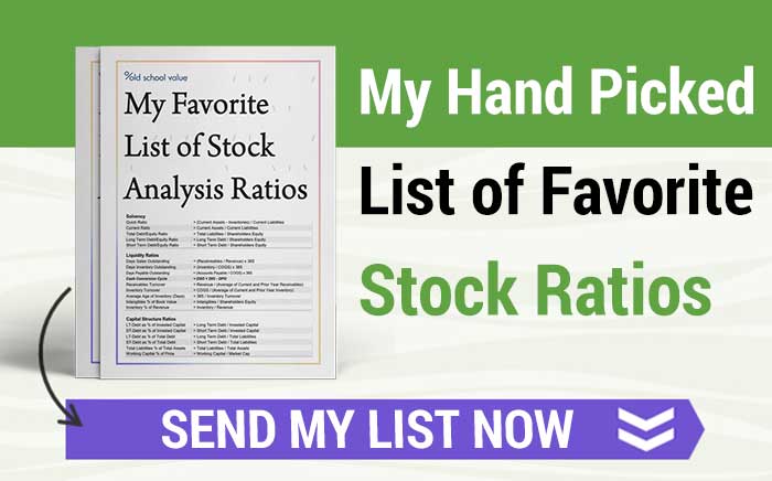
Before you dive into the meat of the content, if you haven’t signed up with your email for our free investment resources, do so.
I’ll immediately send you extra stock ratios notes, checklists, spreadsheets and additional downloads you can succeed with.
If you zoom out and see that the ratio is consistently below 1, there is a high chance of trouble.
If the ratio is above 1, then debt can be covered without having to borrow more.
Take a look at Transocean (RIG).
Users of the Stock Analysis Tool need to go to the “DCF Valuation” section and scroll down to the “Debt” section to see these values.

Lots of debt over the years. Shows difficult industry conditions.
Transocean is an example of a typical company with heavy capex, high fixed costs, and needs to borrow regularly.
Unless you know the oil drilling industry very well and keep up with oil and energy demands, RIG is not an easy company to invest in. The oil industry may look cheap, but unless you take the time to get to know the industry, there will be value traps as companies falter as they are burdened with debt and not enough cash.
Equally, when the Deepwater Horizon oil spill occurred, drillers were crushed and it was a good time to buy when the market was uncertain and scared.
However, the FCF/Short Term Debt ratio shows RIG falling into dangerous levels since 2011.
Is it a coincidence that the stock has fallen on hard times since 2011 with all the debt and lack of cash?

Probably, but it’s a good way to invert your thinking.
#6: Inventory Turnover
or
COGS/Average Inventory
The inventory turnover ratio measures how quickly the company sells its inventory.
Remember the cash conversion cycle above?
The goal is to quickly turn inventory into cash, then reinvest the cash back into inventory, and then turn it to cash again for even more profits.
The more your company does this in a single year, the higher the efficiency and profitability.
How to Use Inventory Turnover
An inventory turnover of nine means that the company has gone through and sold all its inventory nine times during the period.
When you use inventory turnover, you need to make sure that you are comparing with similar companies.
A turnover of two is horrific in the retail industry, but for heavy machinery, it is excellent.
Make sure you are comparing apples to applies.
A high inventory turnover can be achieved via
- tight inventory management (which is excellent)
- or reducing prices to quickly sell (which is bad)
Don’t just blindly accept a number. Always ask yourself why?
More reading on inventory turnover.
#7: Magic Formula Yield
After I first read The Little Book that Beats the Market, the idea and the presentation made sense, but I didn’t believe the results.
I originally wrote about the magic formula investing results with the intent to disprove it, but the results took me by surprise and I appreciate it more.
Here’s the Magic Formula Yield.
It’s just the earnings yield. The inverse of EV/EBIT.
How to Use the Magic Formula Yield
The earnings yield can be used to compare against earnings of another stock, sector or the whole market and even bond yields.
It’s another relative valuation ratio to use with a reference.
I like to look for earnings yield averages of at least 10% to consider it undervalued.
In other words, the EV/EBIT multiple has to be 10x or less.
#8: Piotroski Score
This isn’t a “valuation ratio” but it is a quality score that leads to an easier valuation.
Here’s how the Piotroski Score works.
1. Positive net income compared to last year
2. Positive operating cash flow in the current year
3. Higher return on assets (ROA) in the current period compared to the ROA in the previous year
4. Cash flow from operations greater than Net Income
Points 5-7 of the Piotroski Score, looks at the health of the balance sheet in terms of debt and the number of shares outstanding.
5. Lower ratio of long term debt to in the current period compared value in the previous year
6. Higher current ratio this year compared to the previous year
7. No new shares were issued in the last year
The last two factors of the Piotroski Score looks at operating efficiency.
8. A higher gross margin compared to the previous year
9. A higher asset turnover ratio compared to the previous year
I even took it a step further to narrow down the best Piotroski scores.
How to Use the Piotroski Score
Look for trends.
Is it increasing?
Is it decreasing?
What’s great about the quality analysis metrics like the Piotroski Score, Altman Z score, Beneish M score and so on, is that it breaks it down for you.
A historical Piotroski Score breakdown puts everything into context versus a single number.

#9: Price to Intrinsic Value
This one is tricky.
Simply because you have to know how to value stocks to get the intrinsic value.
Here’s a condensed version on the best stock valuation methods that you can check out.
How to Use the Price to Intrinsic Value
The idea behind using a price to intrinsic value ratio is to invest in the most undervalued stock.
If you have 10 stocks that are undervalued and only want to buy two of the stocks, how do you know which one to buy?
Using the Price to Intrinsic Value ratio helps you compare between your selections.
All the valuation ratios above focused on comparing against industry competitors to see whether a stock is cheap or not.
Here, it boils down to which of the cheap stocks do you want to invest in?
Here’s the image of the EBIT valuation for AAPL model again.

Price to Intrinsic Value Ratio
If the intrinsic value is below the stock price (i.e. overvalued), the ratio is greater than 1.
If the intrinsic value is higher than the stock price (i.e. undervalued), the ratio is less than 1.
Now you can see how this will help you when you’ve got a list of stocks you want to buy.
Go for the one with the lowest ratio.
#10: DuPont Model for ROE
Understanding numbers in context is vital.
ROE is one of those numbers that gets thrown around so often without thought or explanation.
It’s a gimme that a ROE is good and low ROE is bad.
Wrong.
At face value, it looks good, but not when you can break it down further and get deep insight into how the company achieves its ROE.
The DuPont ROE = (Net Profit Margin x (Asset Turnover) x (Equity Multiplier)
ROE = (Net Income/Sales) x (Sales/Total Assets) x (Total Assets/Shareholders Equity)
Who knew you could get so much juicy info from ROE alone.
To get the full analysis and explanation, be sure to check out the DuPont Analysis article.
How to Use the DuPont Model
There two variations you can use for the DuPont model.
A 3 step version (shown above) and a 5 step version.
Use the worksheet in the OSV stock spreadsheet to get both versions analyzed automatically.
ROE is a way to measure the effectiveness of management. Now you can see in which area management is exceeding or lacking.
Here’s a snapshot of the DuPont analysis for AAPL.

3 Step and 5 Step DuPont Analysis of AAPL | Click to Enlarge
If you look at 2013, ROE dropped to 30% from 35%.
The 3 Step DuPont analysis shows you that the main culprit is a big drop in net profit margins. Increase in debt is also a small part of the drop.
The 5 step DuPont analysis takes it further and shows you that operating margins is really to blame.
Then in 2014 and TTM, you can see how an increase in leverage (Equity Multiplier) is causing the increase in ROE because the net and operating margins are similar since 2013.
Cool huh?
If I couldn’t get all this data easily, I’m sure I wouldn’t be using the DuPont Model. But the DuPont now earns a strong spot in my top 10 list.
Work Smarter Not Harder
That’s a philosophy that I’ve always taken. It’s why I started writing this blog and why I started creating tools to make my investment analysis faster.
I’m what Ben Graham would classify as an enterprising investor, I take pride in knowing that I can go through stocks 3x faster than other investors and understanding what a stock is worth and what price I should pay.
I used to waste a TON of time doing everything manually.
If I tried to gather all this data by hand, crunch it and then write this article, it would take days.
The other huge benefit I’ve experienced over the years is that I have more time to think and process the information because I’m not drowning in a sea of information.
The element of thinking is sadly overlooked by a lot of investors.
I know what I like and what to look for and by doing things quickly, I have more time to dedicate to thinking about the investment.
When it comes to your portfolio, are you bogged down with trying to keep up with all your stocks?
Do you want a smarter and more efficient way of processing information quickly so that you can focus on making better decisions?
Do you want to value stocks easily and quickly?
You can get all this with a membership to old school value. Start today and start picking better stocks, making better decisions and more money in the stock market.